The recent shutdown of Google Reader has resulted in me wading through the masses of old articles that i’d bookmarked for later reading but never bothered to. Given the fast-paced nature of tech, a lot of this stuff is now irrelevant but occasionally i find something that is still of interest or worthy of remark. Or something that boils my piss.
Back in May 2012 a story did the rounds about the reasoning behind Apple’s old laptops carrying an “upside down” logo.
When you open up your MacBook, MacBook Air, or MacBook Pro, the glowing Apple logo on its hood sits upright so that everyone in Starbucks knows that you’re using a Mac. However, it hasn’t always been that way. There was a time when Apple logos were upside down on the lid of Apple notebooks, until Steve Jobs realized his mistake.
And here’s the not-at-all-hyperbolic opening from TUAW’s version:
It was perhaps one of the most baffling and frustrating design choices Apple ever made: the upside down Apple logo.
A Steve Jobs mistake. Baffling and frustrating design choice. Hmm. The reason for the “upside down” logo is clearly spelled out in the source material for this story, a blog post by former Apple engineer Joe Moreno:
We were told by the Apple design group, which takes human interface issues very seriously, that they had studied the placement of the logo and discovered a problem. If the Apple logo was placed such that it was right side up when the lid was opened then it ended up being upside down when the lid was closed, from the point of view of the user.
Why was upside down from the user’s perspective an issue? Because the design group noticed that users constantly tried to open the laptop from the wrong end. Steve Jobs always focuses on providing the best possible user experience and believed that it was more important to satisfy the user than the onlooker.
The logo was like it was in order to help users. This story should just be further evidence that Jobs cared more about customer experience and satisfaction than anything else. Yet these stories spin it on its head. TUAW opts to conclude with:
Thankfully, Jobs eventually reversed his decision. […] It also goes to show that Steve Jobs, as great of a design genius as he was, didn’t always make the right design choices the first time around.
Clowns. Fucking poseur clowns. You only use a Mac so you fit in at Starbucks? Who cares what your device looks like to on-lookers? Having the apple “upside down” does aid users with opening the lid. I have witnessed people try to open their Mac from the hinged edge, and fallen for it myself on more than one occasion, because of that logo positioning. If Steve Jobs was involved in this decision then the only mistake you could possibly accuse him of making was giving-in to the Marketing people.
Needless to say, Cult of Mac and TUAW are no longer in my RSS subscriptions.
I grew up in the Eighties. I think my first exposure to a computer was – probably like many people my age – a BBC Micro at school. But that wasn’t the computer i used most as a child. No, while everyone else played with their Spectrums, Commodores and Ataris, our home computer was one my peers had never heard of – a Dragon 32.
The Dragon’s 30th anniversary was last year and i’ve just found this lovely piece on the history of the machine’s development at the Register. It’s nice to learn that the Dragon 32 was more popular than i thought possible growing up.
And now i’m kind of itching for a game of Cuthbert in the Cooler.
Last night Apple unveiled a whole heap of stuff at the WWDC 2013 Keynote event. It’s all rather exciting and you’ll find lots of words already added to the Internet about iOS 7, OS X Mavericks, the new Mac Pro and so on. I won’t bother adding my own recap here. What i do want to mention though are the app icons Apple has produced for iOS 7. I think this new iOS is beautiful – take a look at the screenshots and videos and you’ll see light and elegant new interfaces to all the familiar apps – and yet the homescreen includes some garish, inconsistent and, dare i say it, ugly icons.
image from apple.com
For me, these new icons fall into four categories:
Like! – Calendar, Photos.
Yeah, ok fine – Messages, Clock, Maps, Videos, Passbook, Compass, Phone, Music.
Not so keen on that – Camera, Weather, Notes, Reminders, Stocks, Game Center, Settings
Of course, aesthetics are subjective. You surely don’t agree with my categorisations. And i expect that some of these designs will grow on me and i’ll look back at this post with embarrassment. But right now i really hope some of these icons see lots of “refinement” before iOS 7’s release later in the year.
…
Update: I’ve realised that the above screenshot is missing a few of the new icons. Here are Calculator, Contacts and FaceTime…
Now, Calculator and FaceTime just fall in the “Yeah, ok, fine” category but i’m afraid that Contacts icon needs a new category all of its own. Just horrible. Horrible, horrible, horrible. No wonder it is missing from most of Apple’s current marketing materials.
I’ve also realised that the Voice Memos app is missing from iOS 7 at the moment. Presumably it hasn’t been cut altogether, rather i imagine it has the misfortune of simultaneously being low down the priorities and a difficult interface to “flatten”. It will be interesting to see how Apple replaces that gorgeous old microphone.
I’m not updating this blog as often as i once used to, and occasionally i feel i’m a bit behind on the latest tech news, so it’s really great of HP to show that some things never change.
Here they are in 2013 with new notebooks shamelessly aping Apple’s look, something they’ve been doing for a goodfewyears now. Well done chaps.
For years and years I really liked Google. They gave me great online tools and services for free, built astounding things that helped us all and, perhaps most importantly, just seemed like a nice company. As much as a commercial entity can, at least. Yes, there was the whole mining-information-about-me thing but hey! they’re nice folks, they’re not going to do anything shady with it.
So what has changed? Very little, i guess. They still provide great online tools and services, these are still (mostly) free and Google continues to build astounding things that help us all. It’s just that my opinion of them has shifted. Despite their motto, to me Google no longer seems like a nice company. I can’t pinpoint one thing that caused this change, rather it has been a gradual process – an accumulation of niggles and doubts. And i think Google’s recent decision to shutdown Google Reader (which they’d made the de facto RSS service, having destroying all the competition with a great, free product) was the catalyst i needed to finally make some changes.
This blog (and various other pages at sallonoroff.co.uk) no longer uses Google Analytics. And it no longer makes use of FeedBurner2. I’m in the process of ditching Reader before it vanishes on 1st July, I’ve already migrated the one remaining Google Calendar i still used and i will, once i figure out how, be removing myself from google+. Chrome too will lose out to Safari and/or Firefox. Lastly – and this is the biggy for me – having managed to download a local copy of all my messages, i’ll also no longer be using Gmail for my personal email.
Will Google care? No, of course not. They’ll not notice. But then fortunately i don’t think i will either.
Yes, i admit it, i will probably continue googling with Google. As much as i’d like to go elsewhere, nothing comes close to Google’s search. Sorry, DuckDuckGo. ↩
Apologies to the handful of people reading this blog using Feedburner’s email subscription function. The RSS feed should re-direct but as far as i can tell i’ve no replacement for email. ↩
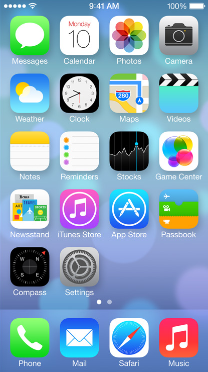 image from apple.com