iOS 7 app icons.
Last night Apple unveiled a whole heap of stuff at the WWDC 2013 Keynote event. It’s all rather exciting and you’ll find lots of words already added to the Internet about iOS 7, OS X Mavericks, the new Mac Pro and so on. I won’t bother adding my own recap here. What i do want to mention though are the app icons Apple has produced for iOS 7. I think this new iOS is beautiful – take a look at the screenshots and videos and you’ll see light and elegant new interfaces to all the familiar apps – and yet the homescreen includes some garish, inconsistent and, dare i say it, ugly icons.
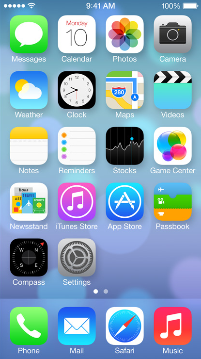 image from apple.com
For me, these new icons fall into four categories:
Like! – Calendar, Photos.
Yeah, ok fine – Messages, Clock, Maps, Videos, Passbook, Compass, Phone, Music.
Not so keen on that – Camera, Weather, Notes, Reminders, Stocks, Game Center, Settings
Fucking hell, Apple – Newsstand, iTunes Store, App Store, Mail, Safari
Of course, aesthetics are subjective. You surely don’t agree with my categorisations. And i expect that some of these designs will grow on me and i’ll look back at this post with embarrassment. But right now i really hope some of these icons see lots of “refinement” before iOS 7’s release later in the year.
…
Update: I’ve realised that the above screenshot is missing a few of the new icons. Here are Calculator, Contacts and FaceTime…

Now, Calculator and FaceTime just fall in the “Yeah, ok, fine” category but i’m afraid that Contacts icon needs a new category all of its own. Just horrible. Horrible, horrible, horrible. No wonder it is missing from most of Apple’s current marketing materials.
I’ve also realised that the Voice Memos app is missing from iOS 7 at the moment. Presumably it hasn’t been cut altogether, rather i imagine it has the misfortune of simultaneously being low down the priorities and a difficult interface to “flatten”. It will be interesting to see how Apple replaces that gorgeous old microphone.
…
Update #2: Designer Frank Chimero has written an excellent and altogether more informed piece on iOS 7’s interface at frankchimero.com/blog/2013/06/generosity-of-perspective/. Well worth a read.